Project brief:
The Chainlink API Documentation helps developers discover and configure Chainlink products. It is high a visibility touchpoint and is often a developer’s first experience with Chainlink.
Through internal discussions, the team has learned the following issues with the current design:
There is poor information hierarchy and a lack of cohesion throughout the user journey across marketing, product, and documentation properties.
The experience is overwhelming, inconsistent, and cluttered.
The search experience doesn’t meet users’ expectations.
The experience is stale and unengaging.
Finding specific content is challenging.
The task: Analyze the current information architecture and see if it can be simplified. Show any iterations or explorations you experiment with along the way. Create a new high fidelity design of the documentation website, make notes of your decision making process, and include any challenges you encounter. How did you arrive at the final design? What did you learn or what would you do differently now? How would you measure and track success?
Additional resources:
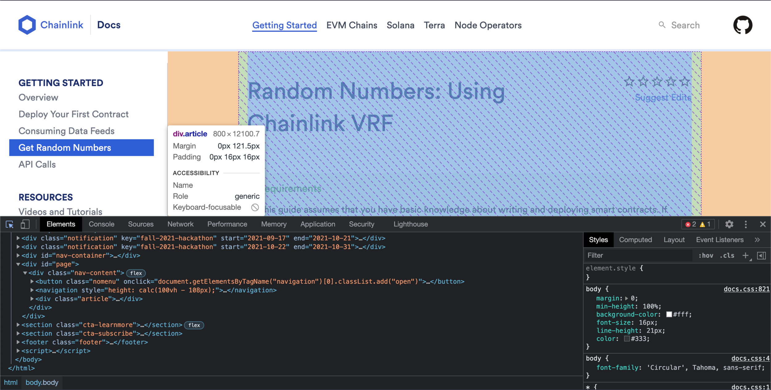
Original pages to be redesigned
(click to enlarge):
Step 1: Information architecture and website review
I spent a few hours up front reviewing the Chainlink website, understanding the page layouts/ components, navigation paradigms and the way the information was organized.
I noticed that the Chainlink Developer Documentation website was the only part of the site that was separate from the rest of the marketing site.
My first big decision was to try and incorporate the docs into the main site. My rationale was that this would add cohesion to the user journey across marketing, product and documentation.
Not an exhaustive list of pages, but pretty good:
Card components (3):
Card component (4):
Documentation site center col:
Step 2: Grid layout for the new pages
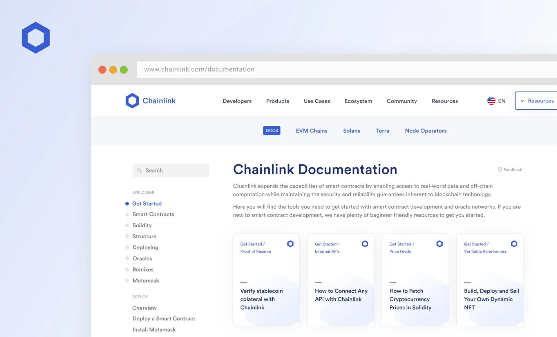
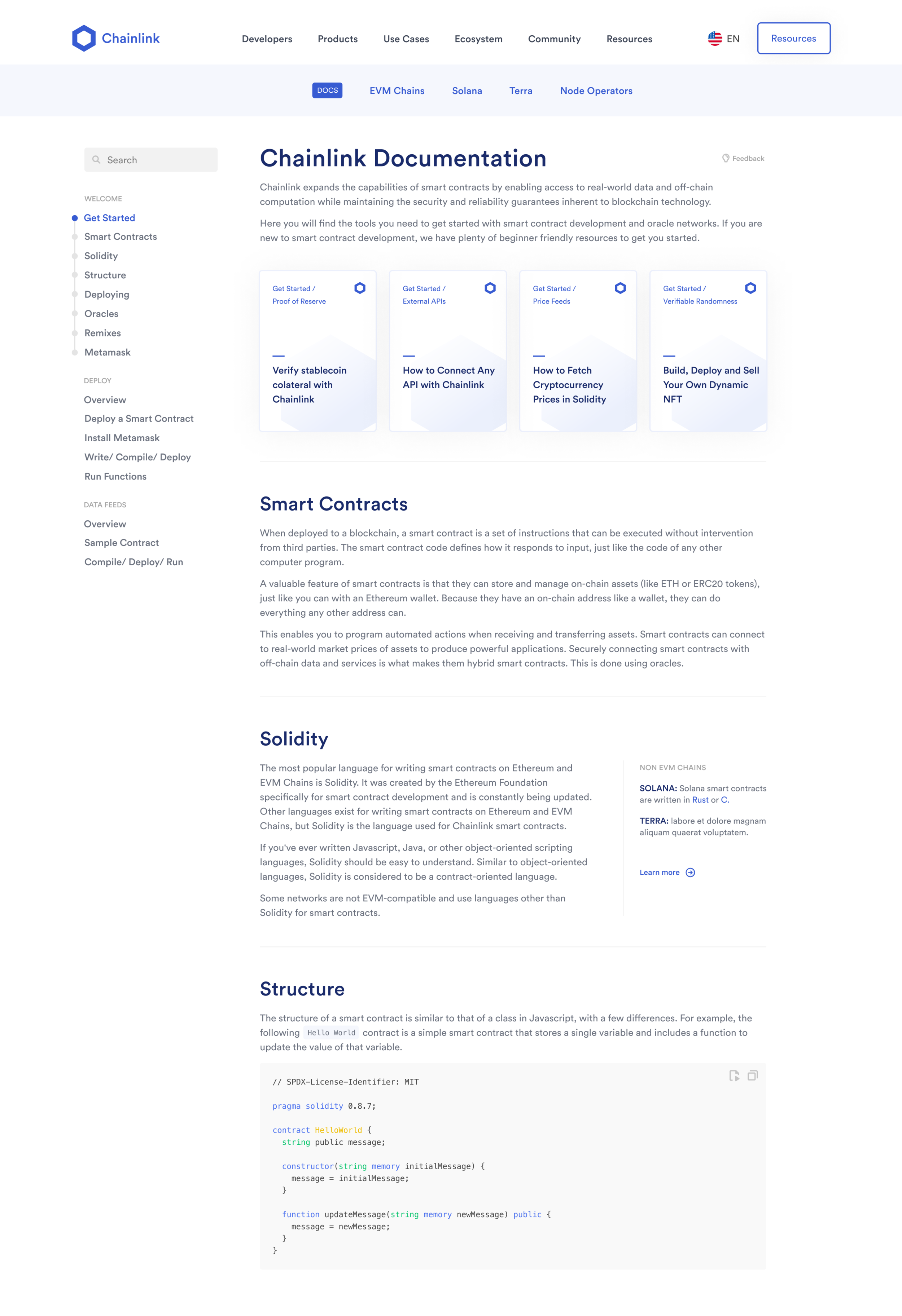
I decided the new docs pages would not have the same layout as the marketing site or the old docs pages, but rather something kind of in between. The marketing pages had a wider content area (1205px) which was good, but there was no sidebar. So, I decided to make a new page template that was 1205px wide but also included a sidebar. This afforded the space for a wider center column (840px) than the old docs pages (800px).
For the primary navigation items on the old docs site (EVM Chains, Solana, Terra and Node Operators), I used a subnav component that I found one of the the marketing site pages. This subnav will be "sticky,” following the user down the page as they scroll. Only when at the very top of the page will the user see the primary nav of the marketing site.
Step 3: Page layouts with content (click to enlarge)
Once we had thumbs up from stakeholders, engineering, the copy team and design director, I produced the final designs with technical specs. This included redline instructions describing all states, interactions and responsive behavior in detail. I use the SpecKit plugin for Sketch to handle basic red lining quickly and embellished where necessary.
When engineering was done we tested the pages on a variety of browsers and devices, but would usually go live shortly after: facebook.com/business/events
Finally, the pages were handed off to stakeholders to update on their own in the CMS.
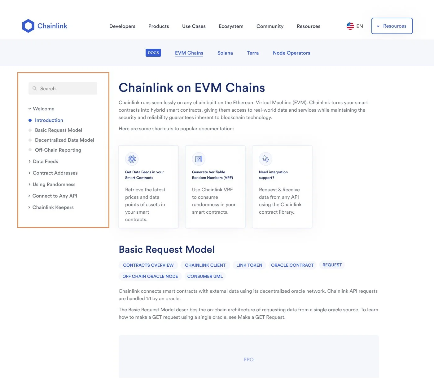
Collapsing sidebar
The EVM Chains page had 40 items in the sidebar, making it a very long scroll. To tame that list, I created a collapsing pattern which opens and closes the appropriate section based on which section is in the viewport.
Menu patterns
To shorten the sidebar, I removed the Resources section and relocated it to the top right button in the main navigation. On the marketing site, this button says “Start Building” and goes to the Chainlink Developer Documentation site. Once on the docs site, we can use that button for Resources.
Another idea along these lines was to extract the entire Data Feeds menu and put it in the subnav, with a drop-down containing each chain’s data feed. I called this menu “implementations.”
Products drop-down
Use Cases drop-down
Resources drop-down menu
Implementations drop-down menu


